visualizing the central limit theorem

I found several animations of the Central Limit Theorem on the web. Most of them are implementations of Galton box that shows how the binomial distribution is close to the normal distribution.

While sketching out the flow chart for a different kind of program, I realized that the same concept can be illustrated in another way, focusing on the analytical aspect of the approximation process (charting the exact probability distribution) instead of the empirical one (sampling from the exact probability distribution) as in the Galton box.

To describe it, consider the classic example of a fair coin to flip repeatedly. In all the tosses the coin has probability 50% of landing heads and probability 50% of landing tails. Now let reason about the number of heads after each toss.

launch of wordpress spam analytics

As I have recently written, blog spam comments could be a cool source of data to analyze, even only for fun. At first I was attracted to comment contents, but then an article on marketpress suggested me some other interesting directions to explore data and inspired me the idea to represent numerical results into interactive charts.

a comment reply by email solution for a self-hosted WordPress blog

For my self-hosted WordPress blog I don’t delegate comment management to platforms like Disqus or wordpress.com. I have nothing in principle against them; on the contrary, I acknowledge that they offer an useful and convenient service. Simply, I belong to (I presume) that minority of people that nowadays prefer a their own solution than a third-party one.

So said, I would have liked very much to enjoy the reply to comment by mail feature that is available for wordpress.com users. It is very very cushy (and in some occasions it is the only way) to continue a discussion within the mail client without the need to open the blog site.

visualizing Simpson’s paradox

Time changes things and ideas. Lately I was thinking that maybe the chart I’ve described three years ago for a two-way table could be not so impressive as I was expecting. Nevertheless I thought continually if in some cases it could be useful to feature its two simple properties: different bar widths and equivalence of their areas with the underlying cluster area to show the contribution of each row (or column) to the overall total and the contribution of each value to the row (or column) total.

Eventually I figured out that the visualization of Simpson’s paradox is one of these instances. Wikipedia page shows three known different graphic representations of Simpson’s paradox: a correlation scatterplot for the continuous case, and two diagrams corresponding to its vector and physical interpretation for the discrete case.

a heat bubble matrix chart for two-way tables


A fundamental concept I reminded in the article I wrote shamefully some very much time ago, is that different charts correspond to different analysis needs and reproduce different views of a two-way table. While at the time I have discussed some charts translating the table by horizontal or vertical sections, that is, by rows or columns, here I’m going to introduce a chart beloging to the group of symmetrical representations, those which do not change transposing the table and hence which deal with rows and columns on the same level either.

from table to chart in WordPress

After having discovered HighCharts, I’ve been cursed by its elegance and simplicity. So I started to make some experiments and then I’ve decided to build a little WordPress plugin which allows everyone to automatically create charts starting from tables of numerical data in blog posts.

Eventually I’ve given birth a plugin which, with a monstruous effort of imagination, I’ve called Table2Chart.

use google spreadsheet as a proxy

Notice: This article can be outmoded due to the availability of new Google services. It should be saved for the uniqueness of its main idea.

Applications of Google spreadsheet functions for external data are virtually endless, and my previous article on how =IMPORTXML() can help to automate the process of collecting web data is just an example. Since fantasy has no limits, I want to show that another possibility is to build… a proxy. Yes, a proxy inside Google preadsheet. Let see.
According to Google help function =IMPORTDATA() retrieves information from a CSV or TSV file, but really it can be used for whatever web page. So, if I am precluded to visit a certain web site, say www.example.com, in theory in an opened spreadsheet I could get the source code of its web page by =IMPORTDATA("www.example.com"), copy and paste the returned string in a notepad window, save it as a html file and finally open it with the browser. If I need another page, I have to repeat all these steps, but clearly this is a bit clumsy.

a one-click bookmarklet for very lazy Diigo users

Update: Diigolet (Diigo Bookmarklet) is currently broken. If you want to restore it please vote to resolve the bug or advise on Twitter

From the Delicious support forum (the page is no more available):

Q: 95% of the time I tag my bookmarks will all the recommended tags and add a few of my own. It would be wonderful if I had one button available that would select all recommended tags so I can get on with adding my own and and deselecting the recommended tags I disagree with.

A: We generally think it’s helpful for people to be selective when adding tags to their bookmarks, and ‘select all’ could encourage people to tag bookmarks with minimal thoughtfulness (which is less useful in the long run).

Tagging is the most effective way to organize bookmarks and to retrieve the right one(s) later by browsing or by searching. On the other hand, it requires some mental efforts to build and follow a classification scheme. This is why I became interested in bookmark managers offering some sort of automatic tagging feature. To this respect, all the ones I know (Diigo, Delicious, Faviki) are far from perfect. Nevertheless, I disagree with the argument of the reply cited at the top of the page. I am a lazy user. I don’t want to be bothered with thinking and writing all the relevant tags about the subject of the page I’m bookmarking. I want an automatic system that makes it for me, even if its tags are not always meaningful. My claim is that the duty to provide a better and better service comes before the need to manually correct its shortcomings.

a batch data processing to visualize social network maps

Notice: Even if the main subject (batch data processing) of this article is still up-to-date, it describes two outmoded services: Google Trends for Websites, which is no longer available, and Google Image Charts API, which is now deprecated.

Several times I have happened to read an interesting work or news and to have an idea on how to delve deeper into the matter, then to renounce because such a task would have required to collect and analyse a lot of online data and I haven’t had the time and the right tool to do it.

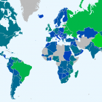
It was so also the first time I have seen the World map of social networks. The chart is nice but the information is a bit poor. Which is the penetration of Facebook or the other most popular social network in each country? Which is the variation occurred in each country between two successive dates? Which is the difference about the number of users between the most popular social network and the second one? Indeed, the situation where the users of the two most used social networks are in a ratio of about 1:1 is very different from the one where the ratio is about 1000:1. Anyway, among the two declared sources of data, Alexa offers freely only rank statistics, as far as I know, and Google Trends for Websites requires to make hundreds of queries to obtain the necessary data, and this was very discouraging.

a virtual keyboard bookmarklet with SuperGenPass support

One. I like bookmarklets. I started to explore and grow on them when I became aware that my dozens of Firefox addons make it poorly responsive.

Two. I like SuperGenPass. For me it is the simplest and most effective way to manage my passwords (Chris, thank you).

Three. I am so, so lazy and mouse dependent that when I surf the web I get annoyed with having to put my fingers on keyboard, and I would happy if the mouse could totally replace the keyboard.

Four. Sometimes it happens to me to surf on computers that aren’t mine, where twharting keyloggers should be necessary even not sufficient.

Five. I find Javascript a bit complicate and mysterious, but I’m ostinately attempting to have more feeling for it.

All these facts have led me to take a stab at converting the great JavaScript Virtual Keyboard Interface (VKI) by GreyWyvern into a bookmarklet and in the meantime adding SuperGenPass integration to it. People surfing with Firefox and GreaseMonkey addon can already install VKI script but I really miss a bookmarklet that can be used in whatever browser. Now I’m quite satisfied by the fruit of my labour (which, after all, has required just few code lines added or changed).